Why Alt Text Matters and How Accessibility Is Actually Measured
Why Alt Text Matters and How Accessibility Is Actually Measured
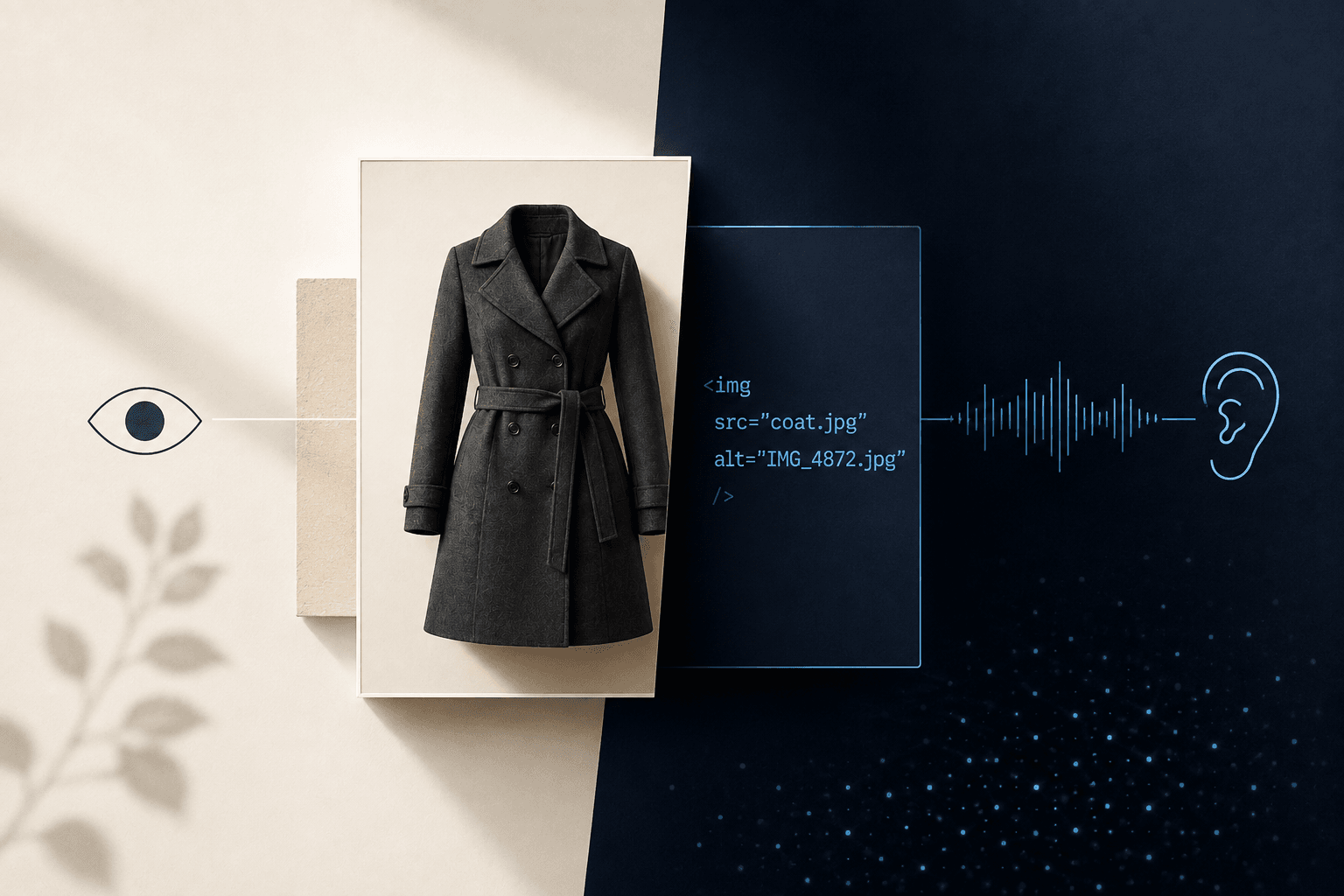
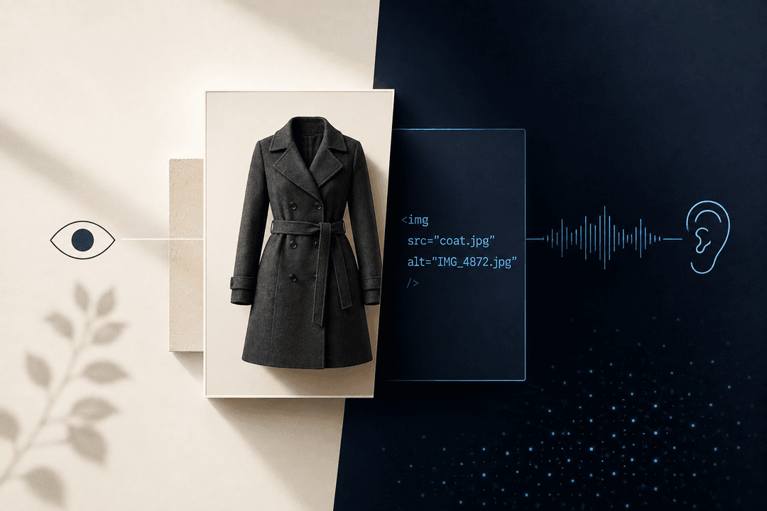
Picture a customer shopping online for a winter coat. A sighted shopper can see that it is charcoal gray, knee-length, double-breasted, and belted at the waist. A customer using a screen reader, on the other hand, reaches the same product image and may hear something like: “IMG_4872-final-new.jpg.”
That’s not a minor technical flaw. One shopper received useful product information. The other received the name of a file.
This is why alt text matters. It is also why accessibility cannot be measured by asking whether an image technically has something entered in the alt field. The real question is whether the person using the website receives the information, context, or function that the image was meant to provide.
Alt text is a small part of a website, often just a few words in the code, often ignored by the people uploading the image. But it reveals a much larger truth about digital accessibility: passing a technical check and creating a usable experience aren’t always the same thing.
What Is Alt Text for Accessibility?
Alt text, short for alternative text, is the written alternative attached to an image in a website’s code. A screen reader can announce that text aloud or present it through a refreshable Braille display, giving a blind or low-vision user access to information that would otherwise be visual.
W3C guidance says the alternative should communicate the information or function represented by the image. The right approach depends on why that image appears on the page. This last part matters, because good alt text accessibility isn’t about describing every visible object in exhausting detail. The goal is to give the user the information they need in that particular context.
Take a photograph of a woman standing beside a bicycle:
- On a lifestyle blog, the useful description might be: “Woman cycling along a tree-lined path in autumn.”
- On an online bicycle store, the relevant description might be: “Red step-through commuter bicycle with front basket and rear rack.”
Same photograph. Different purpose. Different alt text.
This is where a lot of accessibility alt text goes wrong. Someone sees a field labeled “Alt text,” assumes any description will do, and enters “woman with bicycle.” Technically, words are present. Practically, the description might fail to convey the precise information the image was meant to communicate on that specific web page.
Alt text for accessibility is not a caption either. A caption is visible to everyone and may add commentary, credit, or background. Alt text usually lives in the code and is meant to replace the image’s essential meaning when the image itself cannot be seen.
Sometimes a page needs both as they are clearly doing different jobs.
Screen Reader Accessibility Depends on Context
A screen reader doesn’t receive the visual meaning of an image simply because the image appears on the page. It works with the accessible information the page provides. When useful alternative text is present, that information can be read aloud. When it’s missing, the experience becomes vague, repetitive, or completely meaningless.
Consider an online grocery store. A sighted user sees three jars of pasta sauce: tomato basil, spicy arrabbiata, and roasted garlic. The product names beneath the images are clear, so repeating each full product name in the alt text may create unnecessary duplication.
But what if the labels on the jars also identify them as mild, medium, and hot, and that information appears nowhere else? In this case, the images communicate something the shopper needs to know. That information must be available in text somewhere.
This is why screen reader accessibility cannot be handled with a blanket rule such as “describe every image.” The correct question is simpler: What would a person miss if this image disappeared?
A good website accessibility screen reader experience should provide the same essential meaning without forcing the user to listen to useless visual clutter. That balance is the heart of image accessibility.
Decorative Images and Meaningful Images Are Not the Same
One of the most common misunderstandings about image alt text accessibility requirements is the belief that every image needs a written description. That’s not true.
If an image is purely decorative, it should generally have an empty alt attribute, written as alt="", so assistive technology can skip it. Decorative flourishes, spacer graphics, ornamental background shapes, and images that add atmosphere without adding information don’t need to interrupt the reading experience.
W3C guidance is clear that an empty alt attribute is different from omitting the alt attribute altogether. When the attribute is missing, some screen readers may announce the file name instead.
Imagine a restaurant website with a small olive-branch illustration between every section. If the alt text says “green olive branch” six times on one page, the site is technically describing the image and functionally annoying the person using it. The illustration contributes decoration, not meaning. Silence is the accessible choice.
Now imagine the same restaurant uses an image to display its opening hours, and those hours appear nowhere else as real text. That image is meaningful. A user who cannot see it still needs the hours.
The distinction is not based on what the image looks like, but on what the image does. That is the practical logic behind image alt text accessibility guidelines. Meaningful images need a useful text alternative. Decorative images need to get out of the way.
Good Alt Text vs. Bad Alt Text
The easiest way to understand how to write alt text for accessibility is to look at what happens when the wording is too vague, too literal, or written without considering the page. Here are some examples of alt text done right versus alt text done wrong.
A Product Image
- Bad: “Product image” – this tells the user nothing. They already know they are on a product page.
- Better: “Navy leather loafers with gold buckle and low block heel” – this describes the characteristics someone might use to decide whether the product is right for them.
The description should still be considered alongside the surrounding content. If the product name already says “Navy Leather Loafers with Gold Buckle,” repeating exactly the same wording may be unnecessary.
The alt text could focus on a useful visual detail that’s not already available in the product copy. Alternatively, the image may be treated as redundant if the nearby text provides everything the shopper needs.
A Search Icon
- Bad: “Magnifying glass” – accurate, but not useful.
- Better: “Search” – when an image functions as a button or link, the alternative text should communicate the action or destination, not merely describe the icon.
The WCAG alt text guidelines make the same distinction for functional images. A person doesn’t need to know that a button looks like a magnifying glass, but they do need to know that activating it will start a search.
A Promotional Banner
Suppose a banner says: “Summer Sale: 30% off all outdoor furniture through Sunday.”
- Bad: “Summer sale graphic”
- Better: “Summer Sale: 30% off all outdoor furniture through Sunday”
If the offer is already written immediately beside the image, the banner may not need to repeat it in alt text. However, if the only version of the message is trapped inside the graphic, those words need to be reproduced in an accessible form. Otherwise, the sale exists only for people who can see it.
A Staff Photograph
- Bad: “Three people smiling”
- Better: “Three team members reviewing accessibility audit findings on a laptop.”
The better version explains why the photograph belongs in the article. It doesn’t inventory the furniture, clothing, wall color, and number of coffee cups unless those details somehow matter, which they obviously don’t in this specific example.
A Decorative Divider
- Bad: “Gold curved line separating sections”
- Better: alt=""
Nothing has been lost. The user can move directly to the next section.
A Chart
- Bad: “Bar chart showing website accessibility results” – that announces the chart while withholding its actual information.
- Better: A concise alt text summary, followed by the full values or an equivalent data table in the surrounding page content.
Complex graphics usually need more than one crowded alt attribute. W3C guidance recommends providing the detailed information represented by graphs and diagrams in an accessible text equivalent, often elsewhere on the page.
These examples show why teams interested in using proper alt text for images’ accessibility need more than a data-entry checklist. They actually have to understand the image, the page, and the user’s task.
The WCAG Alt Text Rules Are Logical, Not Mysterious
The phrase WCAG alt text can sound more technical than it really is. Under WCAG Success Criterion 1.1.1, non-text content needs a text alternative that serves an equivalent purpose, with different treatment for controls, time-based media, tests, sensory experiences, decoration, and other specific cases.
For ordinary website images, the core idea is pretty straightforward: preserve the information or function for someone who cannot access the visual content. The image guidance tied to this criterion is Level A, the foundational WCAG conformance level.
Consequently, image alt text accessibility requirements do not mean simply adding a sentence to every image. Rather, they resemble the following guidelines:
- If the image communicates information, provide that information in text.
- If the image performs an action, name the action.
- If the image contains important words that aren’t available elsewhere, provide those words.
- If the image is complex, provide a meaningful summary and make the full information available in an accessible format.
- If the image is decorative or fully redundant, use empty alt text so it can be ignored.
That is why a universal alt-text generator cannot make every correct decision. Software can inspect pixels or detect objects, but it doesn’t necessarily know why the business placed the image on that particular page.
A photograph of a crowded waiting room might need one description in a news article about hospital capacity and a completely different one in a page promoting the hospital’s redesigned reception area. Context decides what matters.
Why an Automated Scan Is Only the Beginning
Automated tools are useful. They can scan a large number of pages quickly, identify images with missing alt attributes, flag certain coding failures, and help teams find patterns that would be tedious to locate manually.
But a scanner can usually answer only the first question: Is an alt attribute present? It cannot reliably answer the more important one, and that is whether the alternative text is useful here.
A tool may see alt="image" and record that an alt attribute exists. It may accept alt="" without knowing whether the image is truly decorative. It may find a product photo labeled “red shirt” without recognizing that the product is actually a green dress. It may also miss the fact that ten images in a row repeat information the screen reader user has already heard.
This is the ceiling of automated web accessibility testing. Code can be checked for patterns, but meaning has to be judged. W3C states that evaluation tools help with accessibility assessment, but no tool by itself can determine whether a site meets accessibility standards. Knowledgeable human evaluation is still required.
This doesn’t render automation completely without value; rather, it positions it as merely a single component within a comprehensive website accessibility audit.
How AllyADA Measures Accessibility
AllyADA’s published methodology combines technology, professional review, and lived experience. First, tech-based auditing tools help surface detectable issues across the website. Then CPACC-certified accessibility specialists interpret that data and assess the broader scope of the barriers. Blind and low-vision testers conduct manual reviews to identify problems that algorithms don’t see.
That sequence matters, as an automated scan might report that 42 images are missing alt text. A professional reviewer determines which images are meaningful, decorative, functional, redundant, or complex. A blind or low-vision tester then experiences those decisions in the real flow of the website:
- Can the person understand the product?
- Can they tell one option from another?
- Does the screen reader announce the same promotional message four times?
- Does an image link explain where it goes?
- Can the user move from the homepage to checkout with enough information to make an informed choice?
Those aren’t abstract compliance questions to tick the checkbox. They are ordinary user questions.
This human-centered approach is consistent with how AllyADA describes accessibility in its audits: not merely as the existence of technical features, but as the ability of blind and low-vision users to access information, navigate, make selections, complete purchases, and use the site’s core functions.
A thorough web accessibility audit, therefore, looks beyond simple error counts to evaluate whether the website truly functions for its users.
What Manual Screen Reader Accessibility Testing Actually Finds
Screen reader accessibility testing is not simply turning on a screen reader, opening the homepage, and listening for thirty seconds. A tester moves through the website as a user would. They navigate headings, links, buttons, forms, menus, product choices, error messages, and dynamic content. They hear each image in sequence, surrounded by the exact text that comes before and after it. And that context changes everything.
An alt description may sound acceptable when read alone in a spreadsheet. On the live page, it may repeat the headline directly above it, interrupt a product list with a paragraph of unnecessary detail, or describe a button’s appearance while never explaining what clicking it will do.
During a web accessibility screen reader review, the tester can identify whether the information makes sense in the order it is announced. The team can observe whether missing or badly written alternatives prevent a user from completing a real task.
This is the difference between inspection and use. Manual website accessibility testing also exposes problems outside alt text, like:
- A perfectly described image doesn’t help if keyboard focus gets trapped in a pop-up.
- A clear product photo description doesn’t fix an unlabeled quantity selector.
- A detailed banner description doesn’t help if the checkout button cannot be reached.
Alt text is an excellent entry point into accessibility because the rule is relatively easy to understand, but it definitely isn’t the whole job.
Real Users Are Necessary, but Standards Still Matter
There is an important nuance here. Performing a website accessibility screen reader test with disabled users is essential because real people find usability barriers that conformance checks alone may miss. W3C specifically notes that user evaluation can reveal problems not discovered through standards-based review.
But W3C also warns that testing with users alone cannot determine whether a website is fully accessible for everyone. User evaluation should be combined with WCAG conformance testing and input from an appropriate range of users.
That is exactly why professional web accessibility testing needs layers:
- Standards provide consistency.
- Automated tools provide speed.
- Accessibility specialists provide technical judgment.
- People with disabilities provide the reality check.
Remove any one of those layers and the picture becomes incomplete.
One screen reader user cannot represent every blind person. Blind and low-vision testing doesn’t evaluate every need related to mobility, hearing, cognition, speech, or other disabilities. A standards-based website accessibility audit should define its scope honestly and use the right expertise for the people and barriers being evaluated.
Rather than swapping one shortcut for another, the objective is to establish a methodology that is both comprehensive enough to identify technical flaws and realistic enough to reflect real-world application.
How Businesses Should Handle Alt Text Going Forward
Start by removing the idea that alt text is a box someone fills in after the page is finished. The person choosing or uploading the image should be able to explain why it is there. The content team should know what information the image contributes. The developer should implement the correct alternative. The quality-assurance process should verify the code. Then a human should listen to the page with assistive technology and decide whether the result makes sense.
For teams creating internal image alt text accessibility guidelines, a few questions will prevent most mistakes:
- Why is this image on the page?
- What information would disappear if it were removed?
- Is that information already available in nearby text?
- Does the image act as a link or button?
- Is it too complex for a short description?
- Would announcing it help the user, or merely slow them down?
Those questions are more useful than an arbitrary character limit, as they force the writer to think about purpose instead of filling space.
They also make alt text easier to maintain. For example, when a product image changes, the description should be reviewed. When a campaign banner is replaced, its accessible message should change too. When a decorative graphic becomes a clickable control, it needs a functional name. Accessibility doesn’t survive a redesign by accident.
The Bigger Lesson Hidden in a Small Attribute
Alt text may be one of the smallest pieces of code on a website, but it captures the entire logic of professional accessibility work: neither a visible element, the presence of an accessibility feature, nor a passing scan represents the definitive measure.
The final measure is whether a person can receive the information, understand the interface, and complete the task.
That is why a real website accessibility audit combines automated checks with expert analysis and manual testing by people who use assistive technology. It is also why image accessibility requires judgment and why good alt text is written for a human being, not for a score or checkbox.
Businesses don’t need to treat accessibility as a mysterious technical discipline governed by impossible rules. The rules are usually quite logical:
Preserve meaning. Name functions. Remove noise. Test the result. Fix what does not work.
Start with one image. Ask what it is doing. Write the alternative that gives another user the same useful information. Then test it with someone who actually depends on it. This is the true metric of accessibility. It is determined not by a completed checklist, but by the ability of the end user to effectively interact with what you have created.