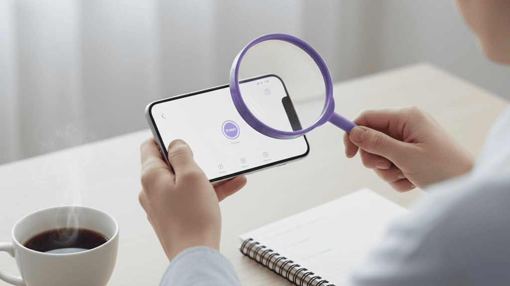
Mobile Accessibility Matters! If You’ve Only Optimized Your Website for Desktop, You’re Failing Your Brand
Make no mistake about it- most web traffic is mobile. Yes, people working an office job do sneak online exploration in throughout the day, but for the most part, no one is running to sit at their desk to look up info, make online purchases, or get stuff done.
People use their phones to do everything. Having a phone in your hand and scrolling or typing with your thumbs is so habitual that it’s changing the way we exist in the world, let alone the way we engage with online commerce.
Want proof? Look up “texting thumb” or “swiper’s thumb.” People use their mobile devices so much, they’re sustaining actual physical injuries to their thumbs!
So what does this mean for you? It means two things: 1. Mobile-based commerce isn’t just the future, it’s the present- the here and now. It simply is and it’s your responsibility as a business owner, brand manager, or web developer to get it right. 2. Mobile accessibility has to be prioritized as part of your strategic plan.
If you want to reach the most people, have the biggest impact, drive the most traffic, and see the most conversions, you must build a website optimized for mobile devices, and mobile optimization means mobile accessibility. These aren’t two different goals- this is one, sweeping perspective on how to make the best possible mobile experience for everyone.
Let’s take a look!
Common Accessibility Issues with Mobile Devices
Need a very practical understanding of what mobile accessibility means? Consider these examples of common issues and think about how they impact nearly everyone at some point in time, not just those consumers with certain specific disabilities.
- Tiny tap targets that require surgical precision to engage.
- Imagine trying to buy something on your phone, but you need to zoom in like you’re conducting a microscopic surgical procedure. Yes, people who are low-vision are absolutely impacted by this problem. But guess who else is too? Everyone! The limited size of mobile device screens means that visibility is always an issue, even for those with typical eyesight.
- What you’re able to see on a 15+ inch desk top screen is clearly entirely different than what you’re able to see on a mobile screen that measures only a fraction of that size.
- Making targets easy to spot and engage with helps everyone.
- Hidden keyboard traps in mobile menus.
- Again, limited size is a huge factor in driving this specific problem. Where a desktop menu has the flexibility to be spread out, thorough, and easy to navigate, a mobile menu more often takes the form of a limited trap-like, unwelcome adventure.
- Common examples of this problem include keyboard pop ups that cover the navigation controls, “submit” buttons that are located below the fold but the page can’t scroll down, and the lack of a “done” or “next” button.
- Gestures with no alternatives.
- There are times when someone needs to engage in an action on a webpage interface, but can’t because they can’t swipe (ever, or just in that given moment). When this happens, they’re stuck. Frozen in total limbo.
- Sometimes the only alternative is to leave the site altogether. Maybe they’ll return, maybe they won’t. But one thing is certain- the very last thing you ever want to do is create or ignore a scenario in which someone who made it to your website now has to leave.
- Common examples of this problem include:
- Swiping traps: Swiping is the only way to go back to a previous page or delete something. The solution is an alternative action button, like “go back,” “delete,” or “next.”
- Pulling traps: Pulling down is the only way to refresh content on a page. The solution is a “refresh” button.
- Zooming traps: Pinching the screen in/out is the only way to zoom in on content. The Solution is a “zoom in/out” button.
- Bad screen reader support for dynamic mobile content.
- Mobile content is in regular flux. It’s just the nature of the device. Pop-up alerts, live chat messages, error messages, auto-updating news feeds or sale alerts, drop down menus that expand and collapse, etc.
- Without thoughtful adjustments at the outset, these fluxes can lead to screen reader mishaps that make the experience a nightmare- no announcements or updated content, failure to shift focus to new content, incorrect reading order for content, missing labels or alerts, etc.
Don’t Take Our Word For It- Test It Out Yourself
At AllyADA, we recognize that our perspective isn’t like other people’s. We live, breathe, and work digital accessibility. Our CPACC-certified specialists have a deeply nuanced understanding of accessibility issues, and our team includes users with accessibility challenges.
A healthy skepticism about the importance of digital accessibility is common among everyone who isn’t in the constant accessibility loop. So we invite you to try it out for yourself.
Pull up your brand or organization’s website and navigate it using VoiceOver or TalkBack. Take notes about your experience, and give us a call. Once you get set up with a digital accessibility audit, you’ll have a whole new understanding of the problems you encountered and the way to get to the solutions.
AllyADA can help you avoid building a beautiful mobile site that’s unusable for millions!
