A Story That Says More Than the Statistics Do
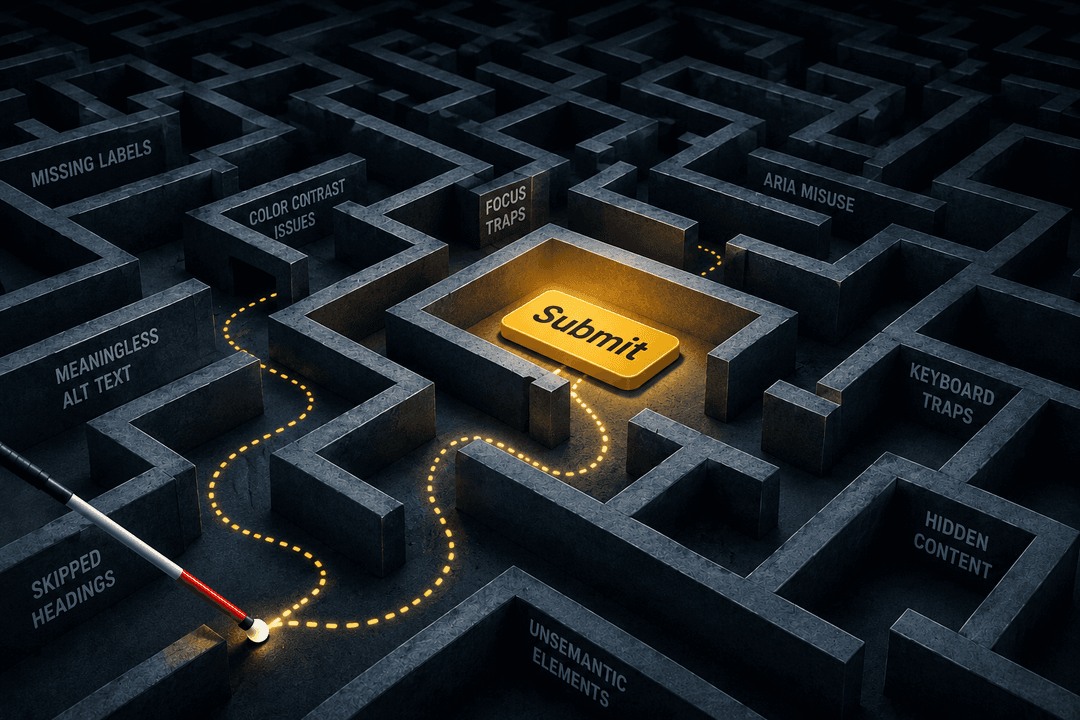
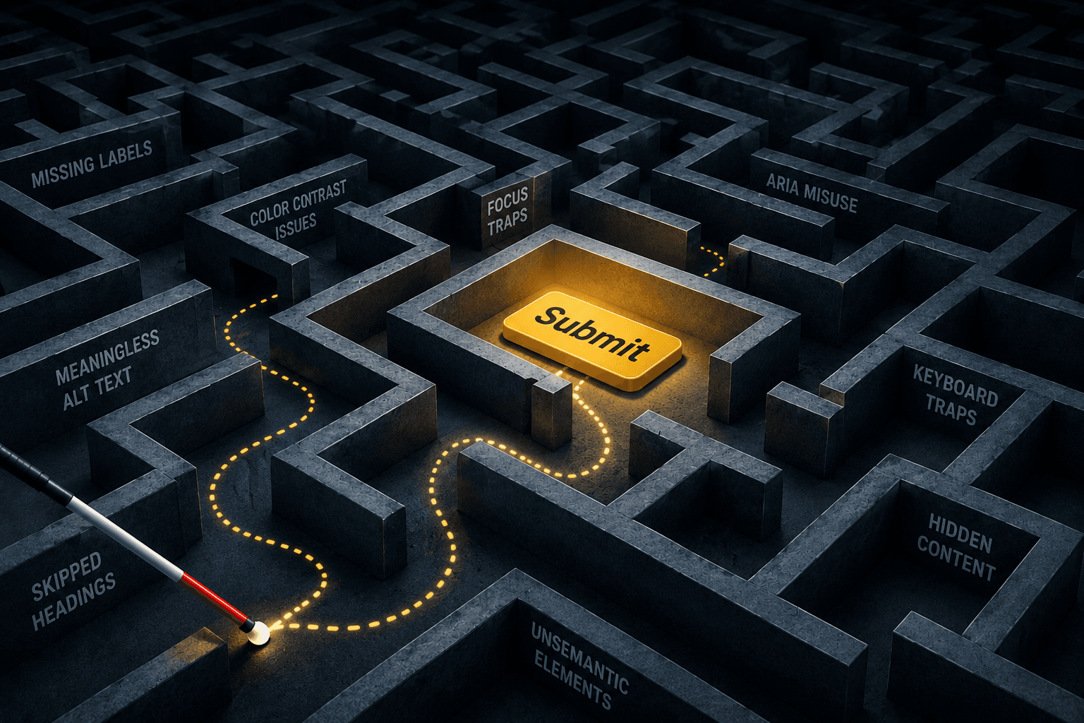
A low-vision user recently told us she spent forty minutes trying to pay her grandfather’s parking ticket online because he isn’t tech-savvy enough to use the internet. Forty minutes. For a parking ticket. The site technically existed. The form was technically there. But the “submit” button at the bottom wasn’t actually a button in the code: it was a div styled to look like one, and her screen reader had no idea it was clickable. She eventually had to ask a sighted friend to complete the payment for her.
That experience isn't unusual. It's also not the kind of thing most business owners imagine when they think about web accessibility. People tend to picture accessibility as a binary state. Either a site is accessible or it isn't. Either it passes the audit or it fails. Reality looks nothing like that. Accessibility exists on a gradient, and where a site sits on that gradient determines whether someone can pay their parking ticket in two minutes or whether they're recruiting friends or family members to help them perform basic adult tasks.
Walking through that gradient is the only way to make sense of why so many sites with good intentions still leave users stranded.
A Brief Detour Through the Basics
Anyone who has recently did a simple web search for "what is website accessibility" or "what is web accessibility" is in good company. Most business owners don't sit with these questions until they absolutely have to. Maybe a customer complained. Maybe a lawyer sent a letter. Maybe a few too many articles about ADA website accessibility lawsuits made them nervous.
The short version: web accessibility means people with disabilities can use a website. That's it. The longer version involves Web Content Accessibility Guidelines (WCAG) – a set of standards maintained by the W3C that most legal frameworks reference when defining what counts as accessible. Within WCAG accessibility, there are conformance levels (A, AA, AAA), and most laws point to AA as the practical target.
But here's where it gets complicated. Meeting the technical requirements of web accessibility guidelines doesn't automatically mean a site actually works for users with disabilities. A site can pass a checklist and still be miserable to use. This pattern shows up constantly in real-world audits, which is why understanding the spectrum matters more than memorizing the standards.
The Annoying Tier – Minor Barriers
The top of the gradient.
These are sites that work, mostly, but they're a little harder than they should be. Picture a low-vision user trying to read body text set at a contrast ratio of 4.2 against the background. WCAG requires 4.5 for normal text, so this technically fails the standard, but only by a hair. The person can still read it if they squint or zoom. Annoying, but not blocking.
Or take a blog post where every link says "read more." There might be eight of them on the page. For a sighted user, that's fine because the surrounding content provides context. For a screen reader user pulling up the list of links to scan the page, it's eight identical entries with no information. They have to navigate back into the body content to figure out where each one leads. The site works. It just costs them time and patience they shouldn't have to spend.
Other examples in this tier:
- Buttons that aren't labeled clearly but have surrounding text hinting at what they do
- Form fields where the label disappears the moment a user starts typing because someone used placeholder text as a substitute for an actual label
- Headings that look like headings visually but aren't tagged as headings in the code, so they don't appear in the screen reader's outline of the page.
This is the layer most website accessibility checkers catch. Honestly, automated tools do a decent job here. A quick website accessibility check flags a list of contrast issues and unlabeled inputs, the team fixes them, the score improves.
That's great. It's also where a lot of organizations stop. They assume the website accessibility testing is done, but it isn't. They've handled the easy stuff. The harder stuff is structural, and that lives in the next tier down.
The Hard Tier – Serious Barriers
This is where things become genuinely difficult for users with disabilities. It's also where most businesses don't realize they have a problem, because these issues rarely show up on an automated checker.
A recent web accessibility audit at a regional clinic illustrates the pattern well. Lovely people, clean site, passed most automated checks. Then came the keyboard test.
The focus indicator was invisible. Not missing, but hidden. Someone in their CSS had set outline: none on every interactive element, probably for aesthetic reasons, and never put anything visible back in its place. So, for users tabbing through the site with a keyboard (and that includes many users with motor disabilities, not just blind users), there was no way to know where they were on the page. Tab. Guess what's focused. Tab. Guess again. Imagine trying to book a medical appointment that way.
That's a serious barrier. All the elements exist. The site doesn't actually work in any way that a human can use.
Other things that show up in this tier all the time:
- Modals that open without trapping focus, so tabbing past the last button drops the user onto invisible elements behind the modal
- Custom dropdowns built in JavaScript that don't announce themselves as dropdowns, leaving the screen reader to call them something useless like "clickable text"
- Carousels that auto-advance with no way to pause
- Skip links that exist in the markup but get hidden visually in a way that also hides them from screen readers.
None of these things destroys the site. A determined user with enough technical literacy might figure out workarounds. But most won't. They'll leave, and the business won't know why their conversion rate from certain segments is mysteriously low.
A proper website accessibility audit, the kind performed by a human actually using assistive technology, catches this layer. A web accessibility evaluation tool by itself, no matter how sophisticated, generally doesn't. The reason why is worth understanding:
- Tools can verify that a button has an accessible name. They can't verify that the name makes sense in context.
- Tools can confirm that an image has alt text. They can’t confirm whether it’s “Blue men’s running shoes” or just “product image.”
- Tools can detect that a heading exists. They can't tell whether it actually describes the section it labels.
Every web accessibility test that relies purely on automation hits this ceiling eventually. This is just the nature of the work.
The Awful Tier (Catastrophic Barriers)
At the bottom of the spectrum sit the sites with zero screen reader accessibility. The ones that simply don't function for someone using assistive technology. At all.
Web accessibility testing has found government portals where the interactive part of the page only renders after a JavaScript call that the screen reader misses entirely, so a blind user opens the page and hears nothing. Just an empty document. E-commerce sites have been documented where checkout worked fine until the final step, where the "place order" button was an image with no accessible name, leaving the user unable to actually submit after filling out everything else. Imagine getting that far and finding the door doesn't open.
A patient portal reviewed at a hospital last year was built entirely as a single canvas element. For anyone unfamiliar, canvas is a graphics primitive. It's a blank rectangle that JavaScript draws on. Screen readers see nothing inside it. There was no way for a blind patient to view their lab results, schedule appointments, or message their doctor. Zero. The portal might as well not have existed for them.
This is what catastrophic actually looks like. Not slow, not annoying, not difficult. Impossible.
And it's more common than most business leaders assume. Failures at this level show up on sites belonging to banks, universities, public utilities. Organizations where someone, somewhere, presumably had this on their radar. Often, nobody was looking.
The legal exposure at this tier is also where things get serious. Most ADA website accessibility cases that reach court involve this kind of failure, because the harm is concrete and demonstrable. A person could not access a service to which they had a legal right. That's a much harder claim for a defendant to dispute than a debate over whether contrast ratios slightly below the threshold constitute meaningful exclusion.
What Good Actually Feels Like
It's worth pausing here because this part gets lost. For anyone who has never used assistive technology, "really accessible" might sound like a stripped-down, minimal-design experience. That's not what it looks like. Some of the most beautifully designed sites in any given industry are also the most accessible. The two aren't in tension.
Here's what a genuinely accessible site feels like to use. A screen reader user lands on the page. Within seconds, they hear the heading structure announced. They know what the page is about, what sections exist, what they can interact with. The links describe themselves. The buttons describe themselves. The forms have labels that remain labels even when the user starts typing. If content updates dynamically, the screen reader announces the change. If a modal opens, focus moves into the modal and stays there until it closes.
For a keyboard user, the focus indicator is always visible and follows a logical path. Tab order makes sense. Skip links allow them to bypass repetitive navigation. Every custom component behaves the way a native HTML element would behave.
For someone with low vision using browser zoom, the layout reflows cleanly at 200 percent. Nothing gets cut off. Nothing forces horizontal scrolling.
The site doesn't feel "accessible" in some special way. It just feels normal. That's the point of good web accessibility design. The interaction works the way the user expects, and they finish what they came to do without having to think about it.
That's web accessibility best practices in action. Not a separate version of the site. Not a special accessibility mode. Just a site built thoughtfully from the start.
The Real Cost of Almost
This part deserves a moment of attention.
When a user hits a completely inaccessible site, they leave fast. The wall is obvious, the bounce is immediate, and the competitor is one search away. Frustrating, but quick. The lost customer is gone in under a minute.
When a user visits an almost-accessible site, the cost differs. They invest time. They start the task. They get partway through. Maybe they're on the third page of an application form before they hit the field that breaks. Now they've spent thirty minutes and have to start over somewhere else. That's the experience that builds real resentment. Not the obviously broken sites, but the ones that pretend to work and then betray the user halfway through.
Users with disabilities often keep informal lists in their heads, like which pharmacy's app works, which bank's site they can actually navigate, or which airline's booking flow doesn't crash their screen reader at seat selection. Those lists are short. The businesses on them tend to have ferociously loyal customers, because being a company that simply works for users with disabilities is rare enough to be remarkable.
The businesses that aren't on those lists usually don't know they aren't. They see lower conversion from certain segments and assume it's a marketing problem, a pricing problem, or a product problem. The reality might be that the site doesn't work for the people in question, and no one ever told them.
Where Organizations Should Go From Here
For anyone reading this and wondering where their own site falls on the spectrum, the honest answer is that they probably don't know yet. Don’t take this as a failure. Most people who run websites have never tried to use their own site with a screen reader. There's no reason they would have.
Finding out and acknowledging it is the first step. Not running another website accessibility check through an automated scanner. An actual website accessibility test in which a real person, ideally one who uses assistive technology daily, attempts the site's main tasks. That's a real web accessibility audit. The findings reveal which tier the site is in.
What organizations do with those findings is where the work starts. Minor barriers are usually fixable in days. Serious barriers might take weeks of development time, depending on how the site is built. Catastrophic barriers can require rebuilding parts of the architecture, and yes, that's not cheap. But it is definitely cheaper than the lawsuit and substantially cheaper than the customers being quietly lost.
Web Content Accessibility Guidelines WCAG provide the technical map. They define what to aim for. But the goal isn't passing the standard. The goal is for the site to genuinely work for the humans who need it to work, and that requires testing with humans, not just running checks against a list.
Accessibility isn't a checkbox – it's a continuum. Every step toward the usable end of that continuum is a step toward a site that serves more of the people who came to use it. That's the actual point. Not compliance for its own sake. Real usability for real people who deserve to be able to pay their parking tickets without calling a friend for help.