ARIA Attributes: The Invisible Language of Accessibility
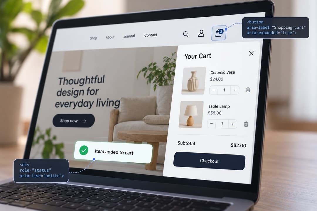
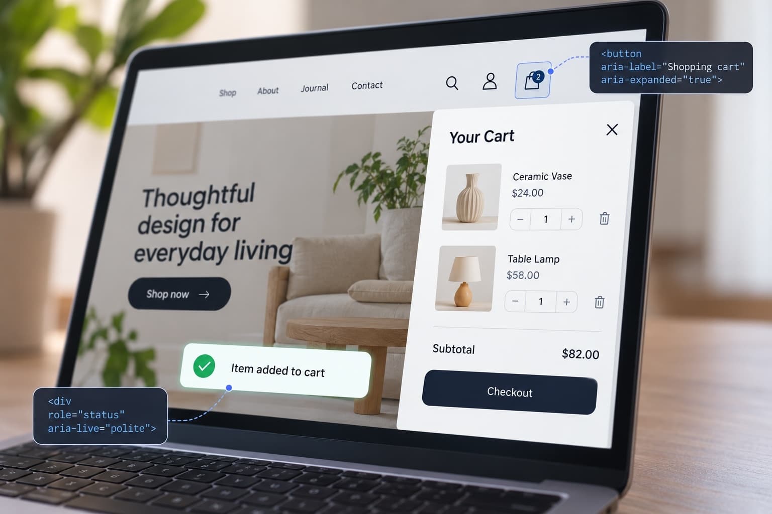
There is a particular kind of website problem that’s almost impossible to notice by simply looking at the screen. Take for example an online store with that little shopping bag icon in the header. You click it, a panel slides out from the right, and there’s your cart. Two products, subtotal, checkout button. Nothing unusual.
Now imagine doing the same thing withoutseeing the screen. You reach the icon with a screen reader and hear, "Button." Button for what? Not sure, yet you activate it anyway. The cart opens visually, but the screen reader is quiet. You don't know if anything has changed. Maybe the button worked. Maybe it didn't. Maybe you should press it again.
Meanwhile, the website isn't broken in the conventional sense and the cart works perfectly well for anyone looking at it. The missing piece is meaning, and that is where ARIA comes in.
What Is ARIA in Accessibility?
ARIA stands for Accessible Rich Internet Applications, which is an impressively complicated name for a fairly sensible idea.
A lot of what happens on a website is explained visually without anyone thinking much about it. A dropdown opens beneath the button you just clicked. An arrow changes direction when a section expands. A form field turns red when something is wrong. A dialog appears in the middle of the screen, and the page behind it fades out. If you can see the page, all of those cues make sense right away, as they happen. Yet, since a screen reader cannot rely on them, the same information has to be communicated to the user through code.
ARIA offers developers a way to include some of that meaning into the code so assistive technology can understand it too and hence communicate further. It includes roles, states and properties that can identify what an element is, what it is called, and what is currently happening to it.
You can think of ARIA as part of the interface most users never notice. A search icon may be perfectly obvious to someone looking at the screen, while a screen reader needs to know that there is a Search button there. When an FAQ section opens, the visual change is clear and enough for one user, while another one needs to be told that the control is now expanded. The same applies when a message such as “Item added to cart” appears without moving the user's focus. ARIA accessibility helps carry those pieces of meaning into the non-visual experience, which becomes especially important on websites that have custom menus, filters, tabs, sliders, pop-ups and content that changes dynamically.
Roles: “What Exactly Is This Thing?”
Let's start with one of the simplest parts of ARIA: roles. A role tells assistive technology what kind of element the user has reached, whether that is a button, a dialog, a menu, an alert, or a navigation region. In many cases, HTML already communicates this information without any extra ARIA involved. If a developer uses a real , for example, the browser already knows what it is, a screen reader can announce it correctly, and the expected keyboard behavior comes built in.
Trouble starts when developers build something that looks like a button out of a generic element. For example:
CSS can make that div blue, rounded and wonderfully button-like. JavaScript can even make it respond to a mouse click, but none of that necessarily tells a screen reader that it is a button. A developer might therefore add: role="button"
The screen reader can now announce “Buy Now, button,” but that doesn’t mean the control actually behaves like one. If the developer has only added the role without implementing the expected keyboard behavior, a user may press Enter or Space and get no response at all. This is one of the classic ARIA accessibility mistakes: the code identifies something as a button even though the interaction itself doesn’t behave like one.
That’s also part of the reason why accessible buttons are usually much easier to build with the native HTML
element than by recreating one from a generic
.
W3C describes an ARIA role as a kind of promise. If you declare that something is a button, you’re taking responsibility for giving it the expected button behavior as well. ARIA itself doesn’t automatically add the keyboard interaction.
This leads to one of the most useful rules in ARIA accessibility: if native HTML already does the job properly, there is usually no reason to rebuild the same behavior with ARIA. If you need a button, use a real button whenever you can.
ARIA Labels: Useful, Until They're Not
ARIA labels solve another common problem. Think about the little X used to close a pop-up. It’s pretty obvious to most people, who take a look at it and immediately understand what it means. But there may be no actual word “Close” anywhere in the interface. Without an accessible name, a screen reader user might hear something vague like: “Button.”
Adding aria-label="Close" gives that control a meaningful, accessible name, so the screen reader can announce “Close, button.” ARIA labels for accessibility are particularly useful for controls that rely on icons rather than visible text.
But when an ARIA label replaces information that was already clearer from the beginning, that’s when the problem starts. Suppose a visible button says “View Cart,” but somebody adds aria-label="Click here". Sighted users still see “View Cart,” while the screen reader now announces the much less useful “Click here.” An accessibility review therefore has to examine the label in context rather than simply checking whether an aria-label exists.
W3C's guidance leans toward visible labels and native HTML techniques where possible. ARIA labeling has legitimate uses, but it shouldn’t replace clear, visible text for no reason.
The Website Changed. Did Anybody Inform the Screen Reader?
This gets more complicated when the page changes after it has loaded, which most modern websites do constantly. A customer opens a menu, applies a filter, switches tabs, submits a form or adds something to a cart, and the page updates without a full refresh. Someone watching the screen can usually see what changed. A screen reader needs that change to be exposed another way.
Take an expandable menu, for example. When it is closed, the code might contain: aria-expanded="false". Open the menu, and that should become: aria-expanded="true".
That sounds almost laughably basic, until you see how often only half the job gets done. The menu opens visually, but aria-expanded stays false. So the person looking at the screen sees an open menu while the person using the screen reader is explicitly told that it is closed.
This is the kind of accessibility failure that makes automated testing tricky. The ARIA attribute is there, and its value is perfectly valid. It just happens to be lying.
Other states work the same way. aria-selected can tell a user which tab is selected. aria-pressed can describe the state of a toggle button. aria-invalid can indicate that the information entered into a field is not valid.
These states are useful only when they stay synchronized with the real interface. ARIA that describes yesterday's state of the page is not accessibility but straightforward misinformation.
Then There Are Live Regions
Take a basic shopping-cart message. A customer presses “Add to Cart,” and a confirmation appears somewhere else on the page. Someone looking at the screen sees “Added to Cart” and knows immediately that the action worked. A screen reader user may still be focused on the original button and hear nothing at all. With no confirmation, they may reasonably press it again and end up with two of the same item in the cart.
ARIA live regions allow developers to tell assistive technology that certain changing content should be announced. aria-live, along with patterns such as status and alert messages, can be used when users need to hear an update even though their focus hasn’t moved to it. WAI-ARIA specifically supports live regions for content that updates dynamically.
That does not mean every changing element should become a live region. If a page starts announcing every carousel movement, autocomplete suggestion, stock update, promotion and background refresh, the result can be more distracting than helpful. Live regions work best when they are reserved for updates the user genuinely needs to know about.
Where ARIA Gets Messy: Menus, Forms and Dialogs
Consider a pop-up asking someone to confirm a purchase. A sighted visitor sees the box appear in the middle of the screen, notices that the page behind it has dimmed, and understands immediately that their attention has moved to a new layer. For a keyboard and screen reader user, that same interaction has to be communicated and managed deliberately. They need to know that a dialog has opened, understand what it is for, move through the controls inside it, and remain there rather than accidentally tabbing into the page behind it. When the dialog closes, focus should also return somewhere sensible instead of simply disappearing.
This is why dialog accessibility involves much more than adding role="dialog" to a container.
ARIA can communicate things such as role="dialog" and aria-modal="true", and it can connect the dialog to its title. But ARIA doesn’t automatically manage the keyboard for you. W3C's dialog guidance specifically combines ARIA semantics with expected focus and keyboard behavior.
The same problem appears in menu accessibility, accessible navigation and accessible forms. A custom menu may contain all the expected ARIA attributes but still have broken keyboard behavior. A field may correctly use aria-invalid="true" without ever explaining what the user entered incorrectly. An icon may have a perfectly good accessible name but sit inside a control that cannot be reached from the keyboard. In each case, part of the accessibility work has been done, but the complete interaction still fails.
This is precisely why ARIA shouldn't be treated as a collection of accessibility tags applied right before deployment. The ARIA attributes and the actual behavior of the component have to match.
Native HTML Is Boring. That's Usually a Compliment.
Developers love building things, and that is generally good news for the internet. Accessibility is one of the places where resisting the urge to reinvent a perfectly functional element can save an impressive amount of trouble.
Need a button? Use
.
Need a form label? Use .
Need navigation? HTML has
.
One of the simplest ARIA accessibility guidelines to remember is to use those native elements when they already do the job. Custom components can absolutely be accessible, but when a developer replaces a native button, checkbox, menu or dialog with a custom version, they also take responsibility for recreating the semantics, keyboard behavior and state information the browser would otherwise provide.
Native HTML already carries accessibility semantics that browsers and assistive technologies know how to handle. W3C recommends using those native techniques when they are available rather than replacing them unnecessarily with ARIA.
Building accessible custom components is entirely achievable, though it demands additional effort when standard solutions won't suffice. If you build your own button, checkbox, menu or dialog, you also take responsibility for recreating the semantics and behavior the browser would otherwise have provided.
What Bad ARIA Looks Like in the Wild
Most ARIA mistakes are not especially dramatic. Nobody launches a homepage with a banner saying OUR ACCESSIBLE NAME RELATIONSHIPS ARE BROKEN.
They are small pieces of code that quietly stop making sense. Here are some examples:
- An aria-labelledby points to an ID that disappeared during a redesign.
- An accordion says it is collapsed even after it opens.
- A visible “Delete Account” button is announced as “Click.”
- A developer uses aria-hidden="true" and accidentally removes useful content from the accessibility tree.
- A modal is labelled as modal even though keyboard users can continue tabbing through everything behind it.
- A custom button has a role but cannot be activated from the keyboard.
Some of these errors look minor when you see them in the code, but they can change the whole experience for a screen reader user. A bad label can make it impossible to tell what a button does. An outdated state can tell someone a menu is closed when it is sitting open in front of them. Poorly handled dialog behavior can leave keyboard users struggling to get back to the page. The visual site may continue to look completely normal, which is one reason these problems can go unnoticed for so long.
Why an Automated Accessibility Test Isn't Enough
Automated accessibility testing is useful here because scanners can catch invalid ARIA attributes, missing accessible names, unsupported roles and required properties that have been left out. What they cannot reliably determine is whether valid code makes sense in context. aria-label="Open" may pass a technical check, but it still leaves the obvious question: open what? aria-expanded="true" may be perfectly valid syntax even if the interface on screen is actually closed. A role="button" can also be technically correct while the control remains unusable from the keyboard.
This is one of the clearest limitations exposed during a web accessibility audit. Software can examine the markup very efficiently, but judging whether the resulting experience is understandable and usable often requires a person.
ARIA accessibility examples make that limitation unusually obvious because the difference between correct and useful can be one word, one state change or one keyboard interaction. A clean automated report does not necessarily mean a clean user experience.
Put a Screen Reader on It
Screen reader accessibility testing changes the perspective because the tester stops inspecting attributes in isolation and starts using the website as a visitor would. They open the navigation, move between tabs, submit a form with an error, add something to the cart and open and close a dialog while listening to what the screen reader announces along the way.
This is also essentially how to test screen reader accessibility in a meaningful way: follow the real tasks people came to complete and watch for places where the information reaching the screen reader no longer matches what is happening on the page. Does the button have a name that makes sense? Does the user know when a menu has opened? Is a form error announced clearly? Does focus move into a dialog and return properly when it closes? Does the control actually behave the way its ARIA role says it should?
Those questions are difficult to answer from markup alone. A technically correct role or state is only useful when it describes an interface that the person can actually operate.
This Is Why AllyADA Doesn't Stop at the Scanner
This distinction between code and experience is also built into AllyADA's approach to accessibility testing. AllyADA's Standard audit includes manual testing by CPACC-certified accessibility professionals together with a user-experience test performed by a low-vision tester. Its wider team includes sighted, blind and low-vision accessibility professionals.
That combination is particularly useful with ARIA because different types of testing answer different questions. An automated scanner can flag a control that has no accessible name. A trained accessibility professional can look at how the component has been built, determine what it should communicate and identify the relevant WCAG accessibility requirements. A blind or low-vision tester can then use that component as part of an actual journey through the site and expose problems that are much harder to see by reading the code alone.
AllyADA’s human-centered approach combines accessibility professionals with blind and low-vision testers precisely because some barriers only become obvious when a person encounters them in real use. That is a much more meaningful website accessibility audit than counting attributes.
ARIA Isn't Magic. That's Actually Good News.
ARIA can look intimidating at first because the documentation includes dozens of roles, states and properties, along with rules for names, live regions, dialogs, menus, tabs and keyboard behavior. The logic behind all of it, however, is much less mysterious. A button needs to be identified as a button and behave like one. An icon-only control still needs a meaningful name. If a menu opens, the user needs to know that its state changed. When an error appears or a dialog takes over the page, that information has to reach someone who cannot simply see the change happen.
If native HTML already handles those things correctly, there may be no reason to add ARIA. When it does not, ARIA gives developers a structured way to communicate the missing information.
This is what makes ARIA a useful example of accessibility as engineering rather than guesswork. The Web Content Accessibility Guidelines WCAG establish the broader requirements, ARIA gives developers a way to expose information that native HTML cannot always communicate on its own, and web accessibility testing shows whether the implementation holds up in practice.
A good accessibility audit therefore does more than check whether the right attributes appear in the code. It checks whether those attributes describe the interface accurately, whether the keyboard behavior matches them, and whether people using assistive technology can complete the same tasks as everyone else. That is ultimately the standard ARIA has to meet: not whether the code looks correct on paper, but whether the website still makes sense when the visual layer is taken away.